CASE STUDY
Poppy + Rose
Creating a mobile-ordering app for a husband and wife duo restaurant that serves country style comfort food in the heart of LA.
Overview
BACKGROUND
Opened in 2014, this restaurant is best known for its chicken and waffles that have quickly become a favorite for Downtown LA locals and visitors. They currently have a working website using a third-party mobile ordering app for takeout and catering services.
CHALLENGE
Every time I had dined here, the lines were long and the limited parking space didn't help either. I realized that this can be solved if they had a mobile ordering app. Currently, they use a third-party mobile ordering app that is linked to their website. This restaurant has a huge potential in building their takeout and delivery operations through their own mobile order app that can further expand their business to other locations.
ROLE
UX/UI Designer
DURATION
4 weeks
TASKS
User Research, Market Research, UI Design
TOOLS
Figma, Procreate, AdobeXD
Tackling the challenge
01
Design a mobile ordering app that meets the goals of the business and the user
02
Implement app features that will aid and improve the take-out operations of the restaurant and the user
DESIGN PROCESS

EMPATHIZE
Market Research
Before diving in, I decided to start off with a secondary research by splitting the market research into 3 sectors. The purpose is to understand how mobile ordering apps affect consumers in the breakfast/brunch market.
RESEARCH GOALS
- Identify Poppy + Rose’s target market
- Identify Poppy + Rose’s competitors and evaluate strengths and weaknesses through competitive analysis
- Understand the market trends of local mom and pop restaurants in Los Angeles
- Discover user pain points offline and online
- Explore the optimization of food ordering process
01
MARKET TREND
- The market size, measured by revenue, of the Breakfast Restaurants & Diners industry is $10.1bn in 2021.
- The market size of the Breakfast Restaurants & Diners industry is expected to increase 7.1% in 2021
- A report by Technomic found that 38 percent of diners between the ages of 18 and 34 “enjoy eating breakfast foods that are often associated with lunch or dinner, like pizza, burgers or grilled chicken sandwiches that have breakfast ingredients added.”
- Many of the ingredients seen on the breakfast menu can be reincorporated to make lunch and dinner menu items. The fluidity in ingredients helps assuage the problem of space when it comes to kitchen preparation between meals.
- According to Technomic, 42% of millennials would like more foodservice operations to offer chicken for breakfast
02
CONSUMER TREND
- According to Technomic, 38% of consumers between 18 and 34 enjoy eating breakfast foods that are associated with lunch or dinner
- 71% of Americans wish restaurants served breakfast all day says Technomic
- Brunch margins are significantly higher than dinner because customers are willing to pay a premium because of the perceived value that comes with local and organic foods and a higher level of service
- 56% of consumers say that the ability to place food orders online via a mobile app would make them order more frequently from a restaurant
- U.K Research states that 70% of consumers rather order directly, preferring that their money goes straight to the restaurant, not a third party. Only 15% said they didn’t really care how much money the restaurant received from their order.
03
MOBILE ORDERING TREND
- Mobility in retail is now a $5.7 billion business worldwide and continues to grow rapidly
- Mobile orders are projected to make up 11% of all QSR sales by 2020. Projections estimate that over 10% of all Americans already used some type of mobile payment as far back as 2016
- On-Site meal pick-up is the most popular choice through branded apps (57.7%). Delivery through branded app (51.5%), delivery through third-party app (33.5%), on-site food pickup through third-party app (31.2%)
- U.S. restaurant visits paid by branded mobile app increased by 50% from 2017-18 as stated by the NPD Group
- The NPD Group also states that mobile order represents 60% of all digital restaurants today
Competitive Analysis
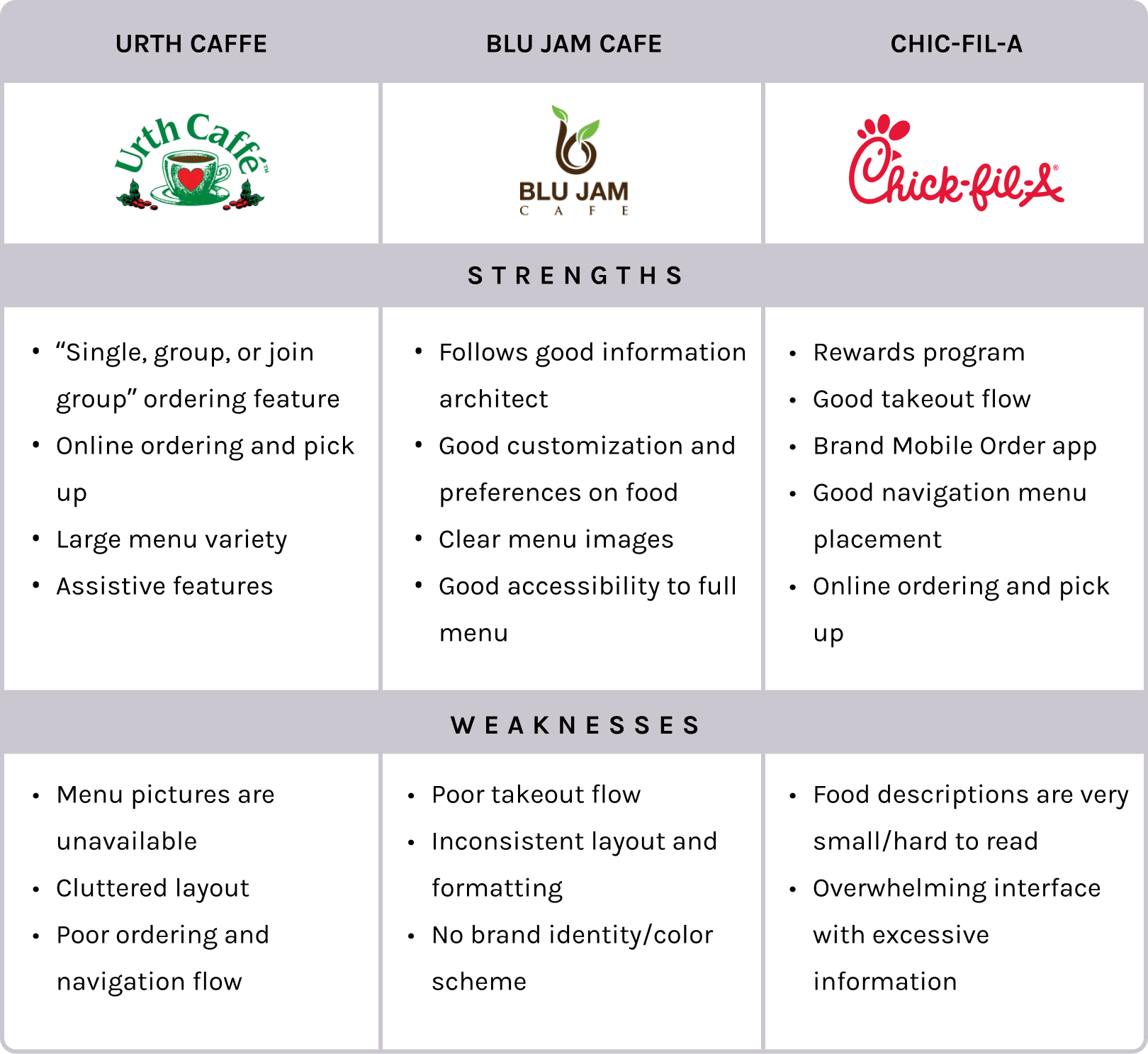
I also conducted a competitive analysis based on the mobile ordering experience of Poppy + Rose’s direct competitors. Competitors have similar operations in purpose, food, and takeout. After computing a competitor audit, I was able to summarize the competitors’ strengths and weaknesses. This insight will help me explore ideas to consider and avoid during the design ideation process.
Figuring out the target users
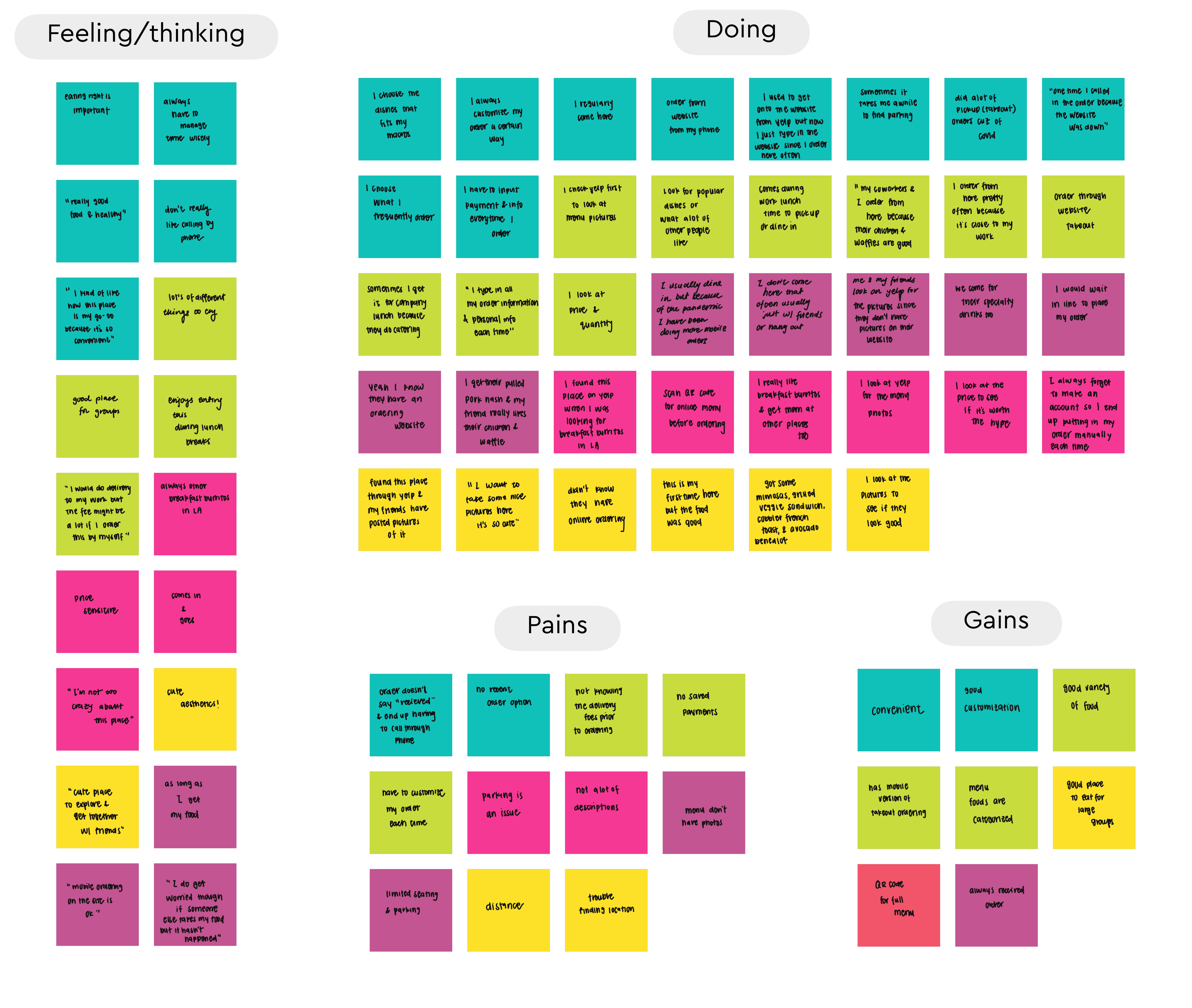
I wanted to understand who my users are and how this ordering app can tailor to their needs. I went to Poppy + Rose with a friend for a casual lunch to conduct some user interviews with the restaurant’s customers. I asked them questions regarding their feelings and insight during their ordering process to see what their pain points are while also learning about their overall ordering experience. These user interviews helped me gain some perspective and pinpoint who my users are.
I asked 5 customers the same open-ended questions:
- How often, why, and when do you order food online?
- How did you hear about this place?
- Have you used the mobile ordering service through their website? If so, can you describe your experience?
- What influences your decision when placing mobile orders?
- What frustrates you or annoys you when you place mobile orders?
Insights
Needs
01
Accurate pick up times are important
03
There are lots of regulars here that frequently order their favorites
02
People have large interests in popular/recommended dishes
04
The main deciding factors for dish selection are visual representation and price
01
Informative and up to date pick up times
03
Saved customer profiles for effortless checkout
02
Dish recommendations or popular menu items
04
Have clear food images and prices on menu
DEFINE AND IDEATE
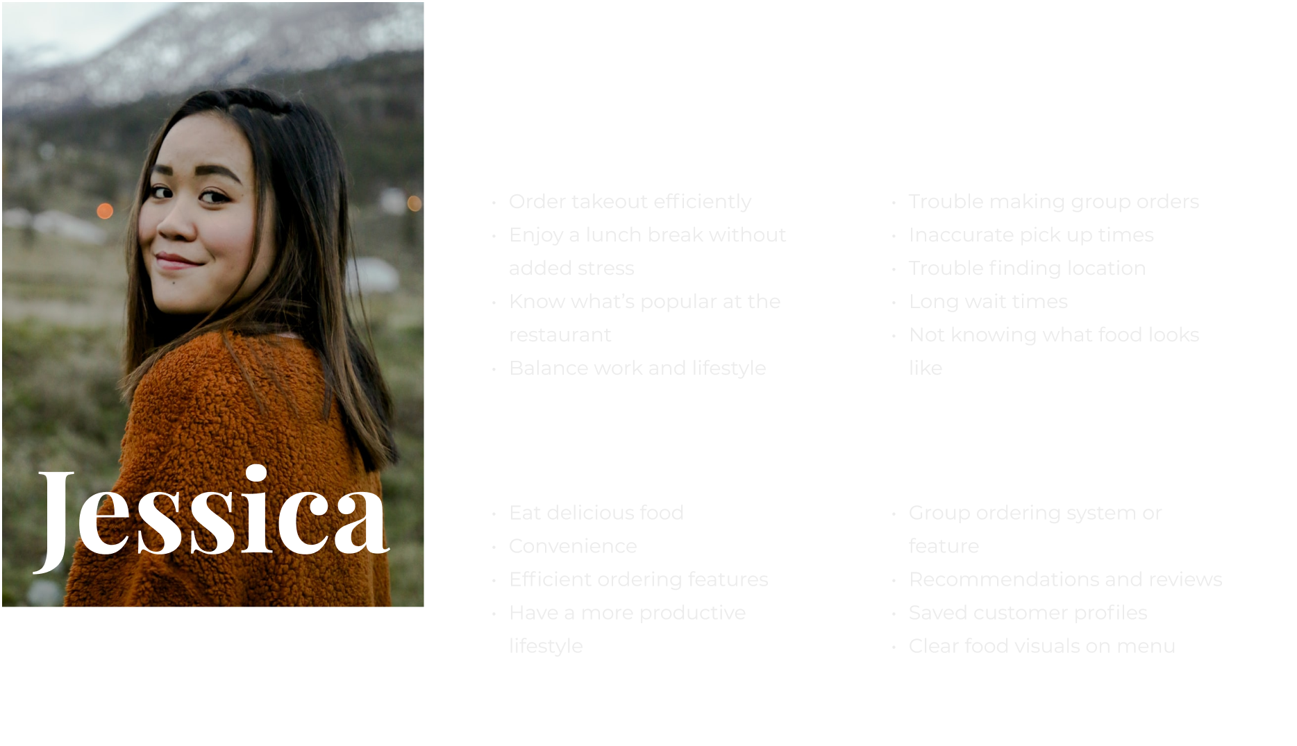
Using Jessica as our target persona, I have summarized the necessary insights and needs to help identify How Might We questions. These would help identify actual problems that need to be solved.
HOW MIGHT WE QUESTIONS
Identified problems

DEFINING THE GOALS
Before coming up with solutions and deciding what to implement, I wanted to set clear goals on what I want to meet. To ensure that I am moving in the right direction, I defined the business and design goals.


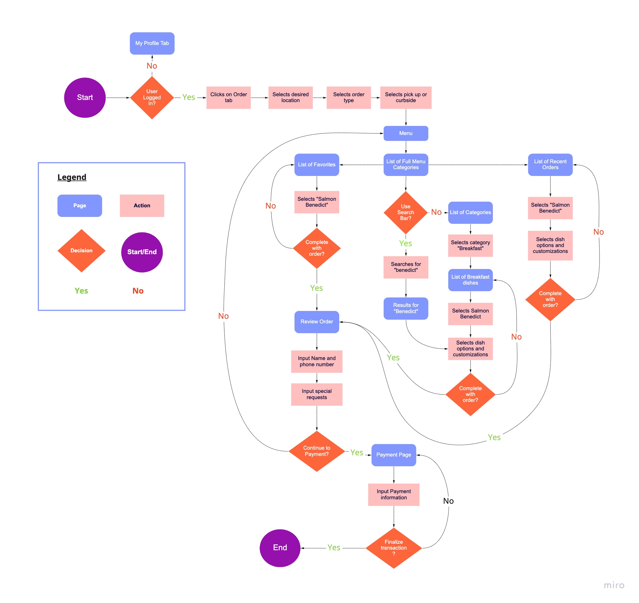
Site map
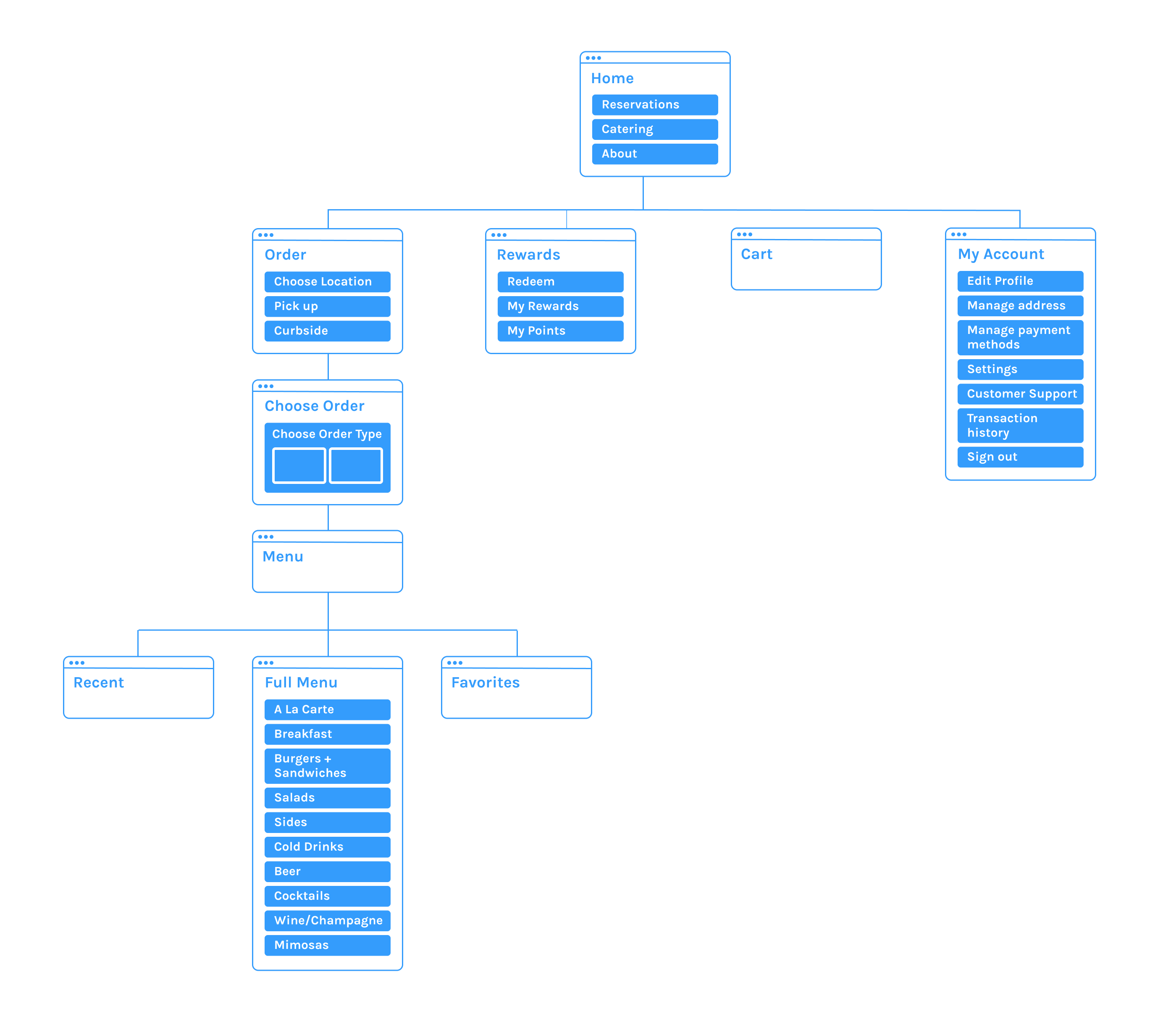
Using the defined goals, I created a site map to organize the overall structure of the app that is both logical and easy to navigate for the user.
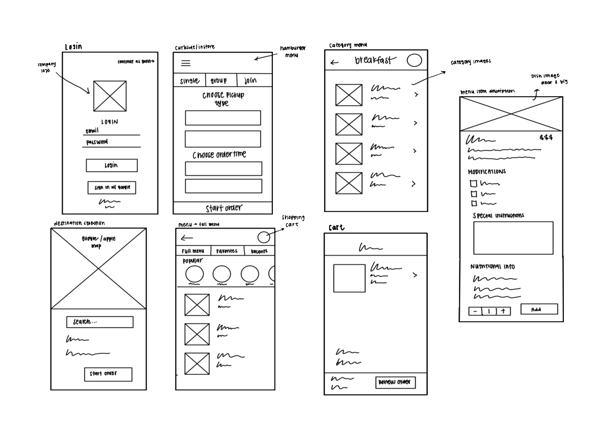
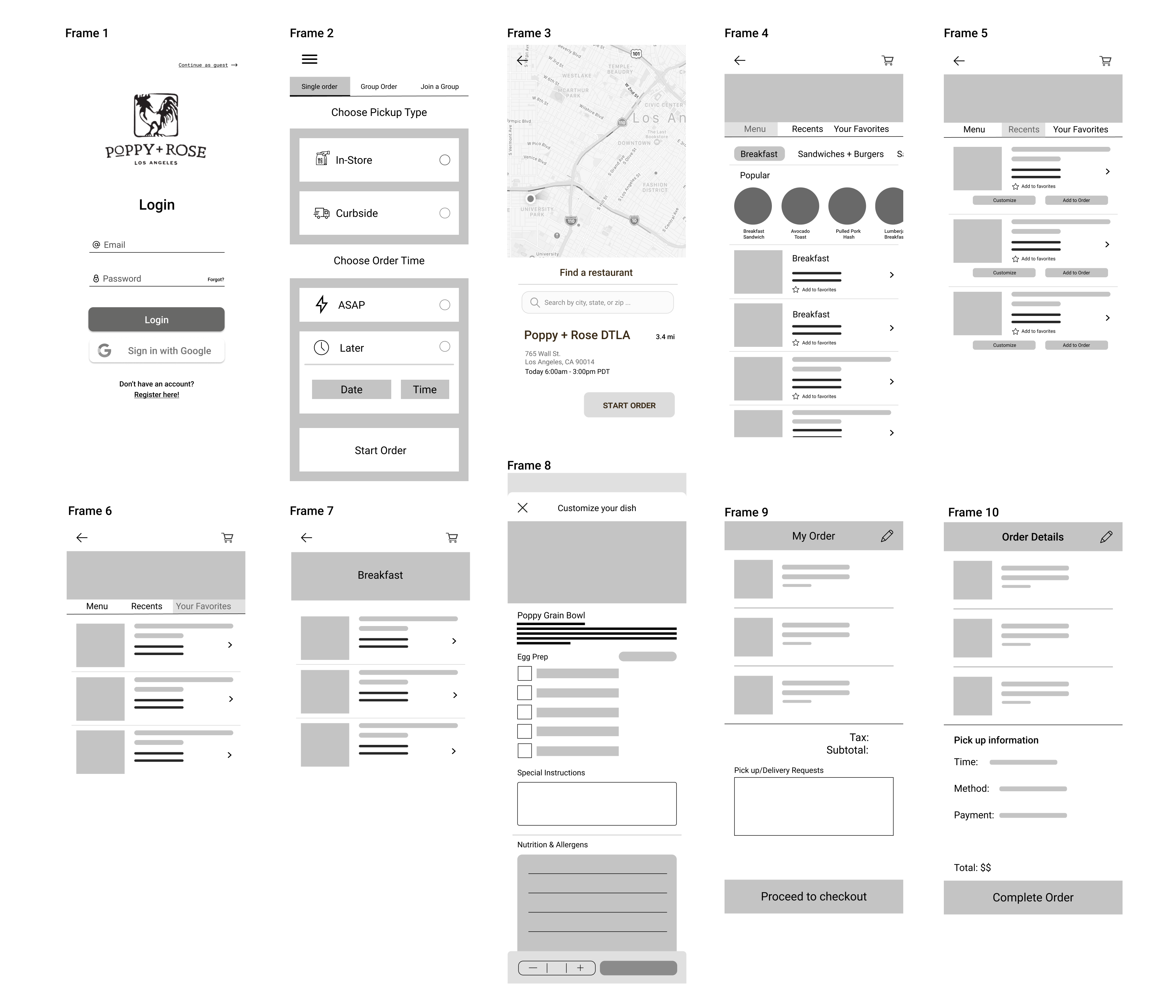
Low Fidelity Wireframes
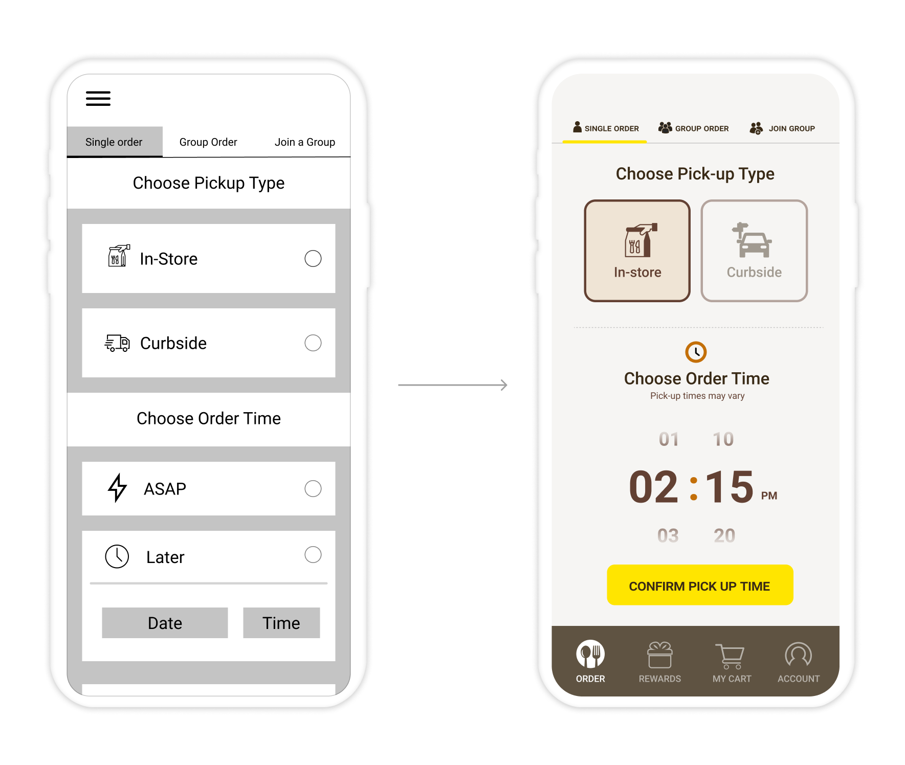
After establishing the app structure and understanding users' decisions, I went ahead and created a low-fidelity wireframe to have a better idea of where images, text, buttons, and interactive elements might be placed. I explored different concepts of navigation options and button sizes. This is the rough draft I came up with:
PROTOTYPE AND TEST
Testing mid fidelity wireframes
Tasks
I asked participants to complete the following tasks:
- Identify the menu and what the restaurant has to offer
- Proceed to check out process (given that user has already made an account with payment information already inputted)
- Navigate through the app
Summary
- Method: Remote, Concurrent Think Aloud
- Participants: 4
- Age: 21-27
- Average time: 8 minutes
- Task Completion Rate: 100%
- Error-Free Rate: 99.2%
Results
01/ First Impressions
Some users claimed that they had already forgotten the time slot they had selected for their pick up as well as if it was curbside or in-store. They would have to navigate back to the beginning of the user process to make sure or edit it. As users shop and make decisions, the app should prioritize a lighter cognitive load for the user by repeatedly reminding them of their previous selections.
02/ Navigation
The app could use more room for errors in the user flow. As users navigate through the menu, they realize that they had to go back to a specific page to see what was in their cart with the mindset that all the progress done so far will be reverted. Having a hidden hamburger menu only slows down and confuses the user flow, so I decided to implement a bottom tab bar navigation.
03/ Menu layout
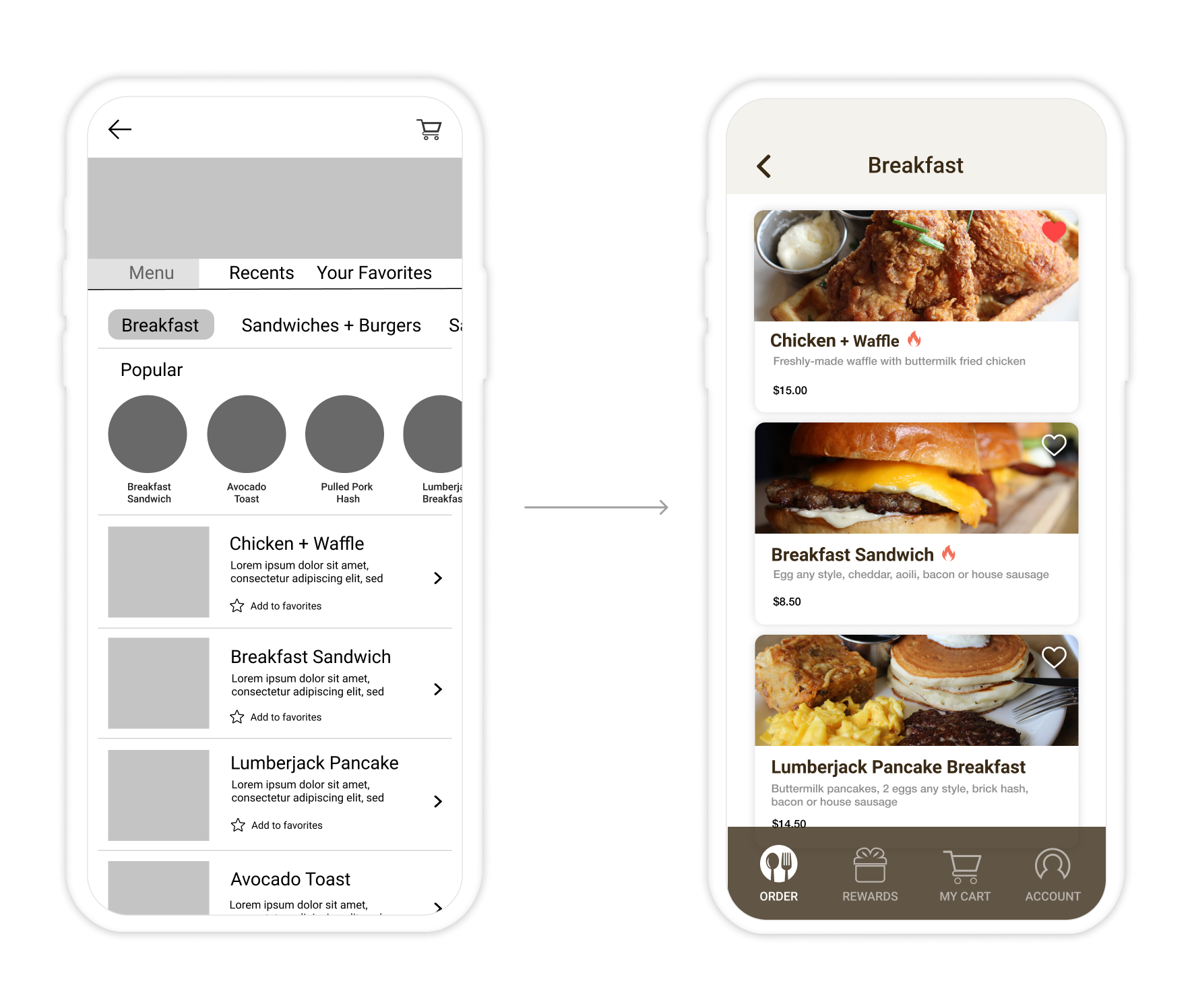
Users noticed that the indication of prices were not very clear and that the menu images could be bigger without having to click into it. Users were also unclear of what the box on the top of the menu pages indicated.
Style Kit
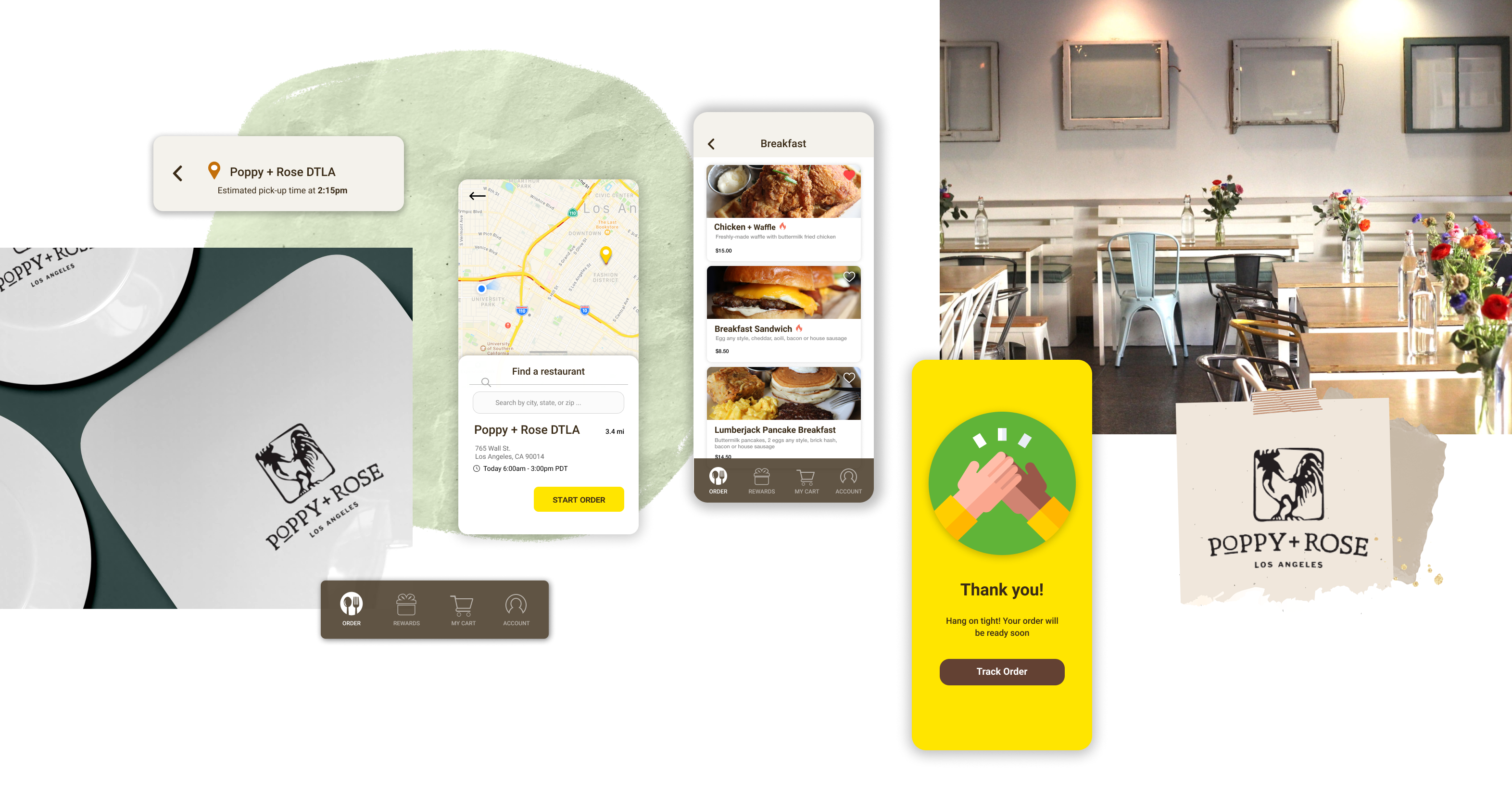
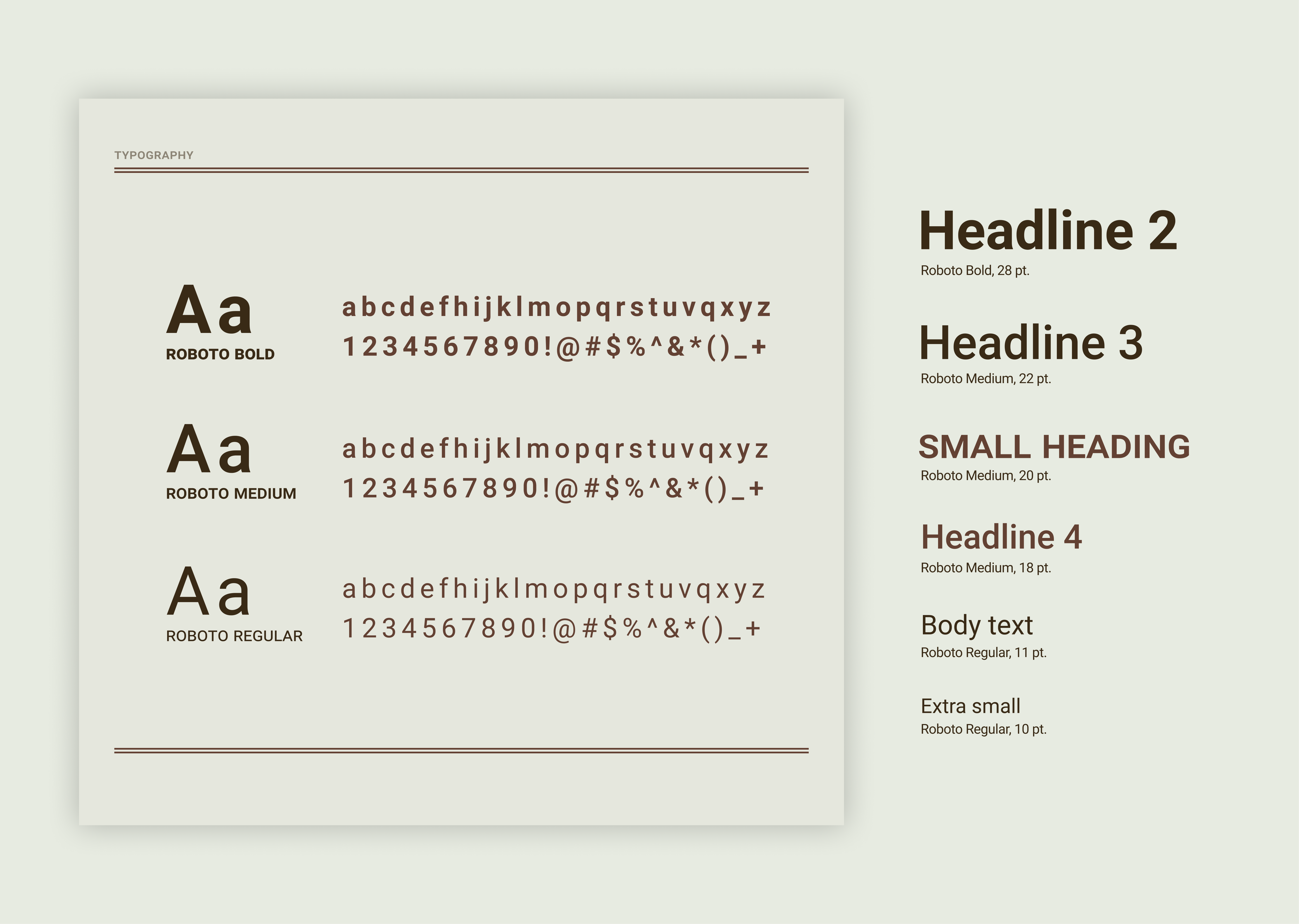
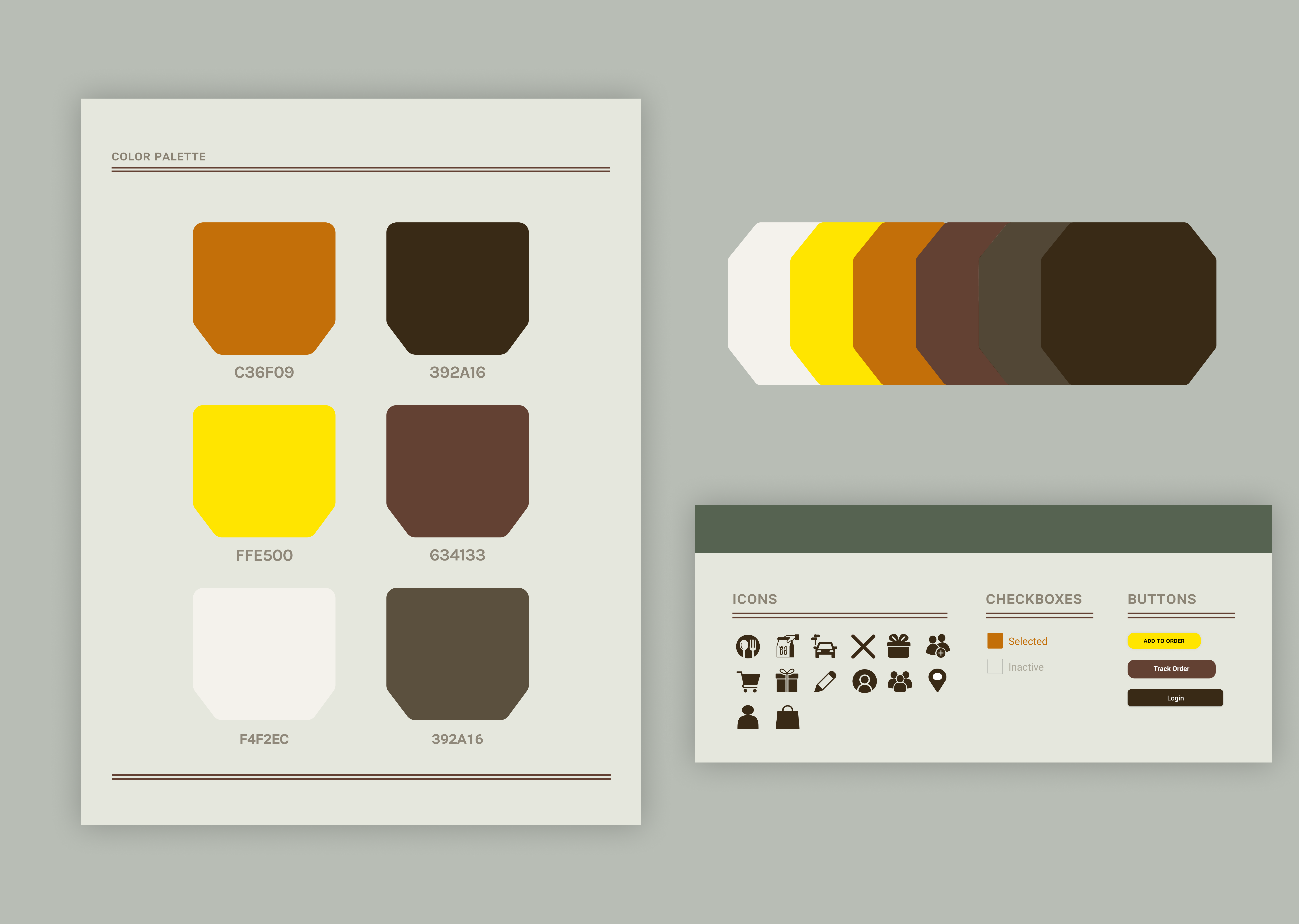
Revisions
NAVIGATION
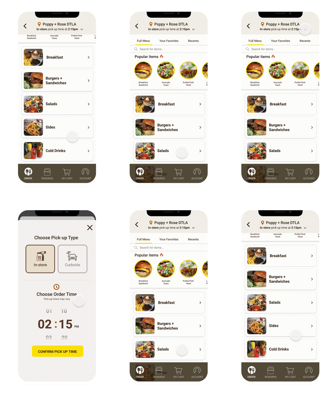
In response to a better user flow and room for user errors, I implemented the bottom tab bar navigation so that users can always revert back to the home page and not lose track of progress.
The cart tab is stabilized so that users can always see what’s in their cart without having to hop onto a specific page. This allows for a smoother user flow without putting weight on their cognitive load.
MENU
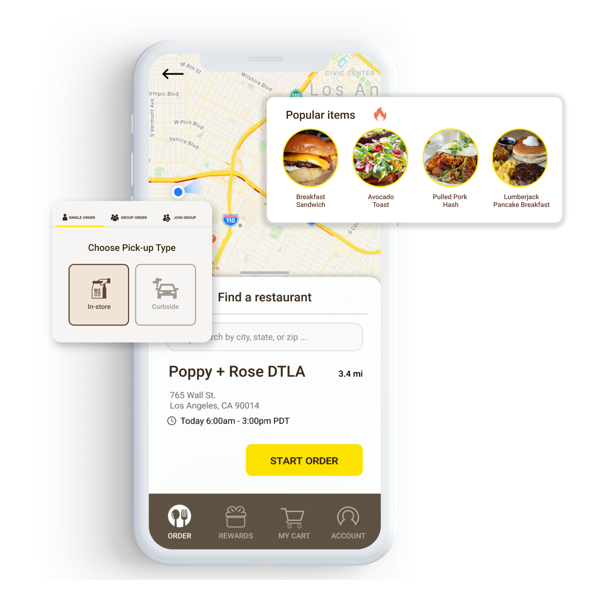
I revised the menu images where each category and selection has its own wide image so that users can easily identify what the food looks like before having to click into it. I took in consideration of users’ feedback in wanting bigger photos and better indication of prices. Having a bigger picture also allows more room for food description and prices.
Nutritional information is also provided in the item food descriptions to avoid allergies or and dietary restrictions.
Features
SELECTION REMINDERS
Users explained how they would sometimes forget what their selected pick-up times and locations were when selecting their dish choices. With this in mind, I created a tab on the top of the menu so that it creates less of a cognitive load and uncertainty.
Users would be able to easily edit their pick-up times and location without having to jump back to the first page. Selection is also reminded in the overview in the checkout and can be edited.
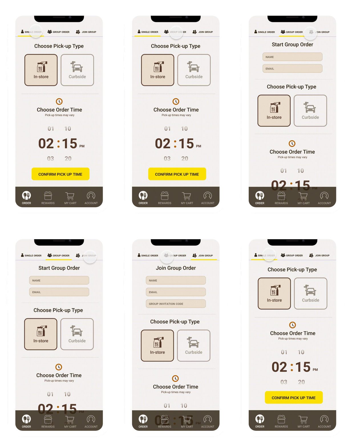
GROUP ORDERING
Users are able to create or join a group order for faster checkout. Each group created is provided a group code that others can join via invitation. Each member is responsible for paying their own amount that has been ordered in addition to taxes or fees.
Reflection
This was my first project utilizing the design process after taking a few courses on UX/UI. There is still a lot to learn and improve on but I have gained a lot of insight and experience during this process. This project idea stemmed from my own experiences at restaurants like Poppy + Rose and I have always tried to look at the bigger picture in how I can contribute to these businesses. During my research process, I saw the importance of empathizing and understanding users and just how valuable their feedbacks and insights are. I've contributed countless hours in researching and designing while balancing school and I enjoyed every moment of it. Although there were constantly things I want to improve, redesign, and make I learned that I needed to prioritize what is more important and beneficial in the long run.
