Milana
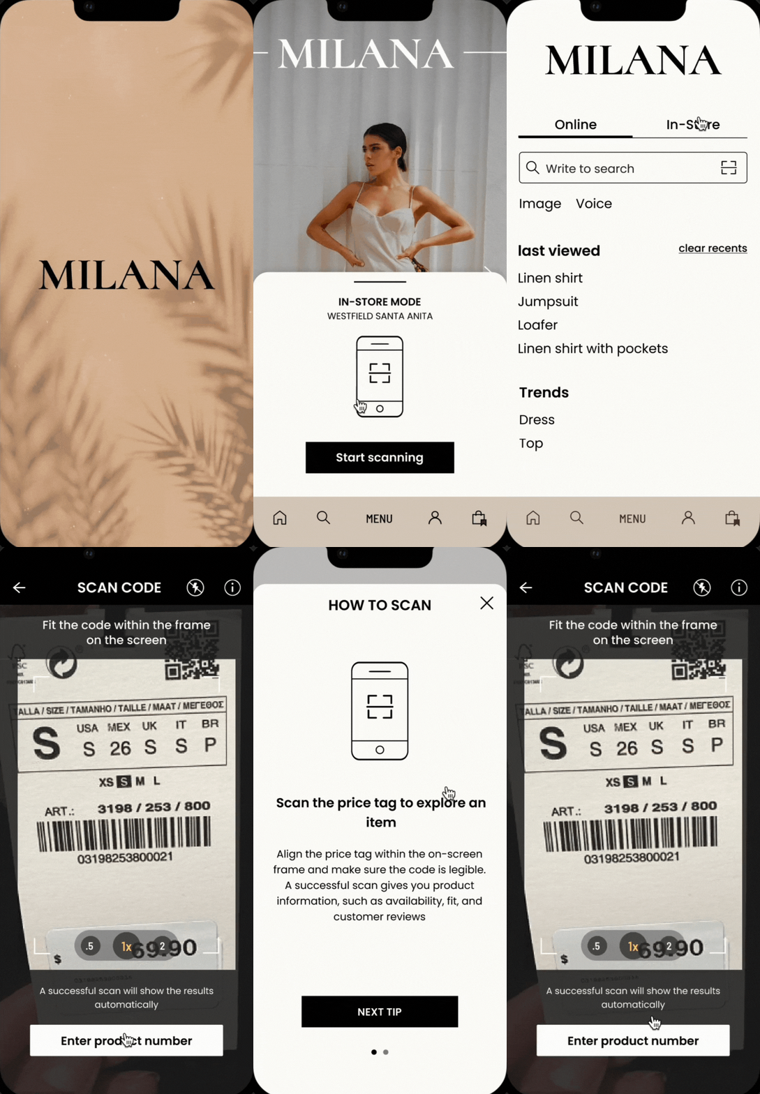
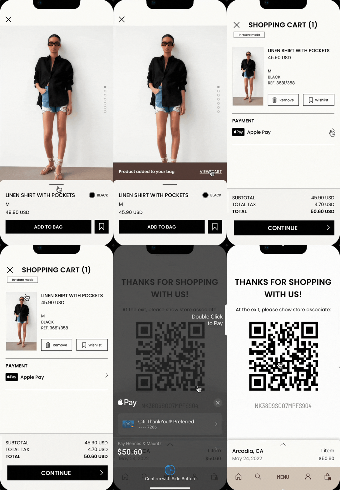
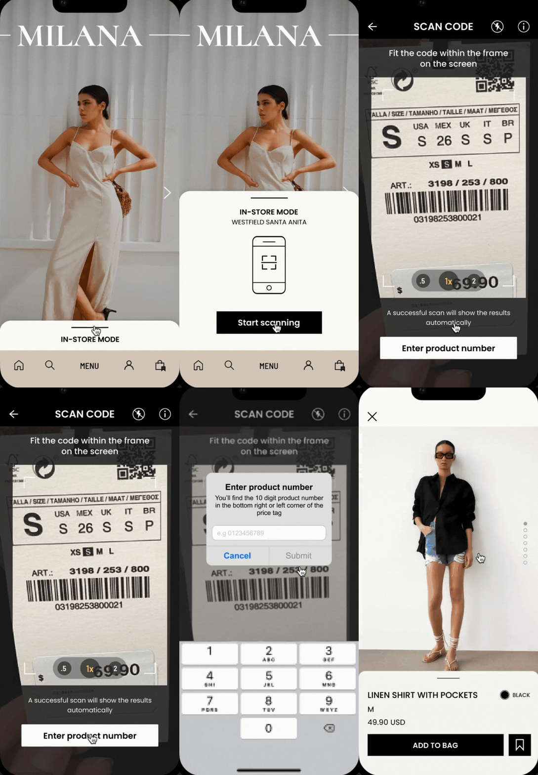
Milana is a retail app for a hypothetical store that utilizes self-scanning features for faster in-store checkout. This project is aim to find a solution in diminishing long queues while bridging the gap between in-store and online shopping experiences.
Role: UX Design, UI Design, User Research
Tools: Figma, Miro, Maze, Marvel
Duration: Jan - July 2022
Hey there, this is the default text for a new paragraph. Feel free to edit this paragraph by clicking on the yellow edit icon. After you are done just click on the yellow checkmark button on the top right. Have Fun!
CONTEXT
With the rise of the Covid-19 pandemic, there has been a shortage in staff at physical retail stores at all fronts. Due to a lack of store associates, it has caused many inconveniences and long queue lines while putting the remaining store associates in jeopardy. We’ve seen an avoidance of these lines simply by just shopping and ordering online, saving yourself a trip to the store. But for some, shopping in stores is a privilege and a leisure activity.
PROBLEM
How can we diminish inconveniences and long queues imposed on retail stores with staff shortage and large consumer base?
RESEARCH PLAN
With this being said, I decided to do some research by carrying out a UX Design approach, which means approaching the flow, the system, and the tech itself. I have a very broad solution idea in response to this problem which is to allow customers checkout through their phones in the physical store after scanning products. This research is to find solutions that will improve the overall self-checkout experiences, hoping to integrate convenient mobile experiences into retail stores.
WHITEPAPER RESEARCH
MARKET ANALYSIS
Before diving into the visual elements of design, I wanted to learn more about the background and history of self-checkout to really understand what kind of systems I will be working with. Having familiarity with its market condition, identify issues to be addressed, and seeing the pros and cons of self-checkout implementation can help me uncover better solutions. On the other hand, mobile payment is also a large topic to be addressed with the implementation of self-checkout, especially if the goal of the transaction is to be contactless and free of lines.
COMPETITIVE AUDIT
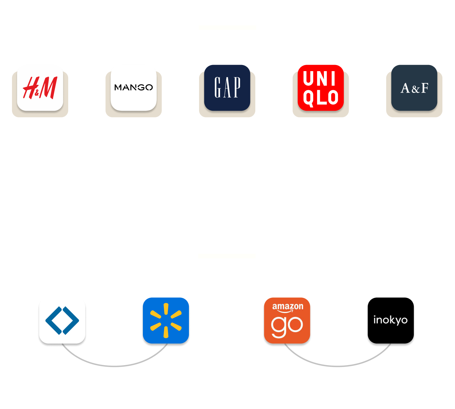
Now that I have a better understanding of self-checkout and mobile payment’s influence on the retail industry, I wanted to learn more about who our competitors are. What has worked for them and what hasn’t, and what opportunities we can gain from it. I asked questions like, “What can we learn from this app? Is there anything we could be doing better or differently? Did they miss the mark somewhere that we can capitalize on?”
PRIMARY RESEARCH
CONTEXTUAL INTERVIEW
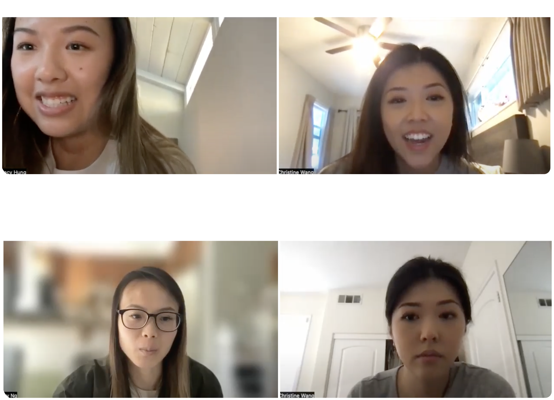
With 5 candidates, I asked them questions regarding their shopping experience online and offline. I wanted to know more about their decision making process when they’re shopping and checking out, what painpoints they’ve encountered, and what other experiences have helped them achieve their goals. I also asked them to walk me through their experiences so I can get a better understanding for my user journey map later which would be really helpful in understanding the overall shopping flow, and how to best implement the in-store scanning feature.
Research Questions:
- Are you comfortable with mobile payments like apple pay or google wallet? When do you use it?
- Can you tell me more about your experiences with retail customer service in stores?
- In your survey, you said that you liked _____’s mobile self-checkout system. Why?
- What are some benefits you found shopping on the mobile app than in stores?
- Can you walk me through your process when shopping in retail stores?
- What is your experience like when making a purchase on the retail apps?
- Can you walk me through your shopping and checking out process on retail apps?
PRIMARY RESEARCH
AFFINITY MAPPING
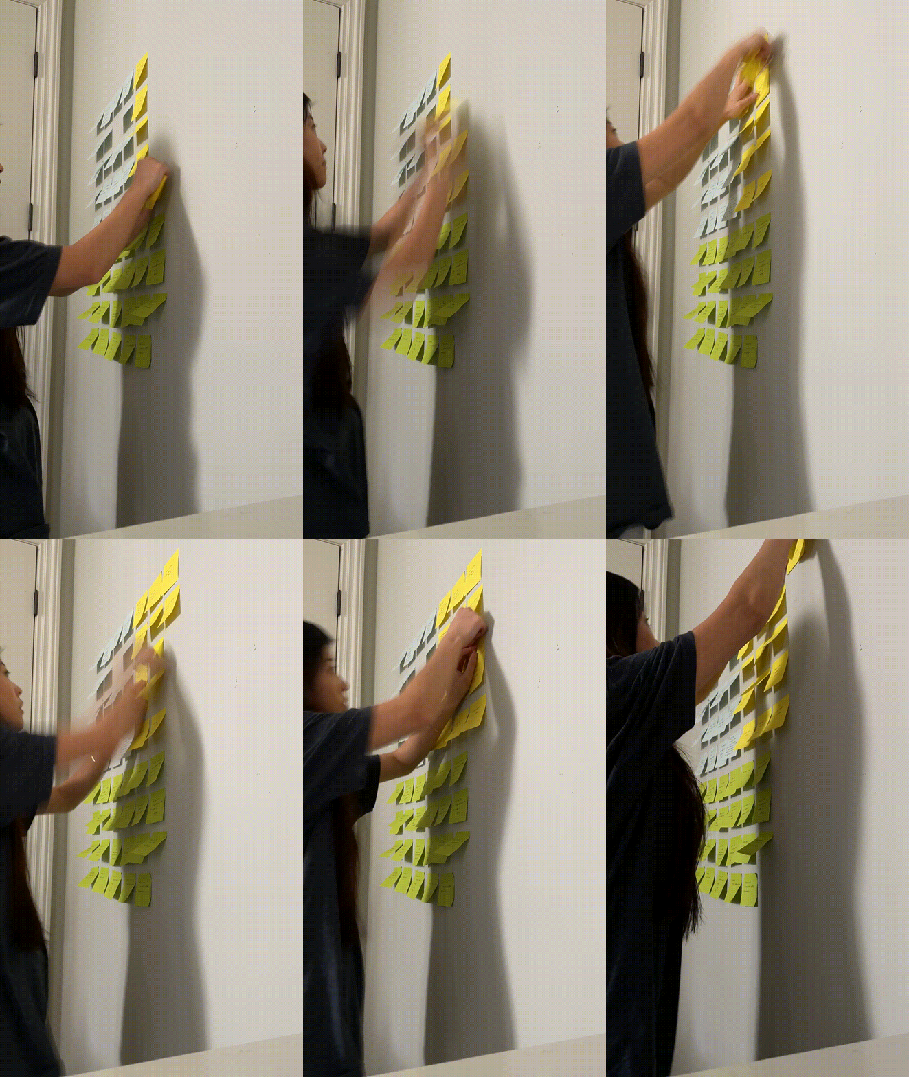
After my user interviews, I went through each video and collected any insight or quotes that I felt really stood out to me or is important. I spent some time looking at each idea and sorting them into groups according to whatever themes I find useful. I found connections to what I found valuable within those groups and came out with these findings.
"Seeing a long line immediately discourages me from shopping, let alone walk into the store."
"So much time wasted digging through the store and waiting in super long lines. It's frustrating!"
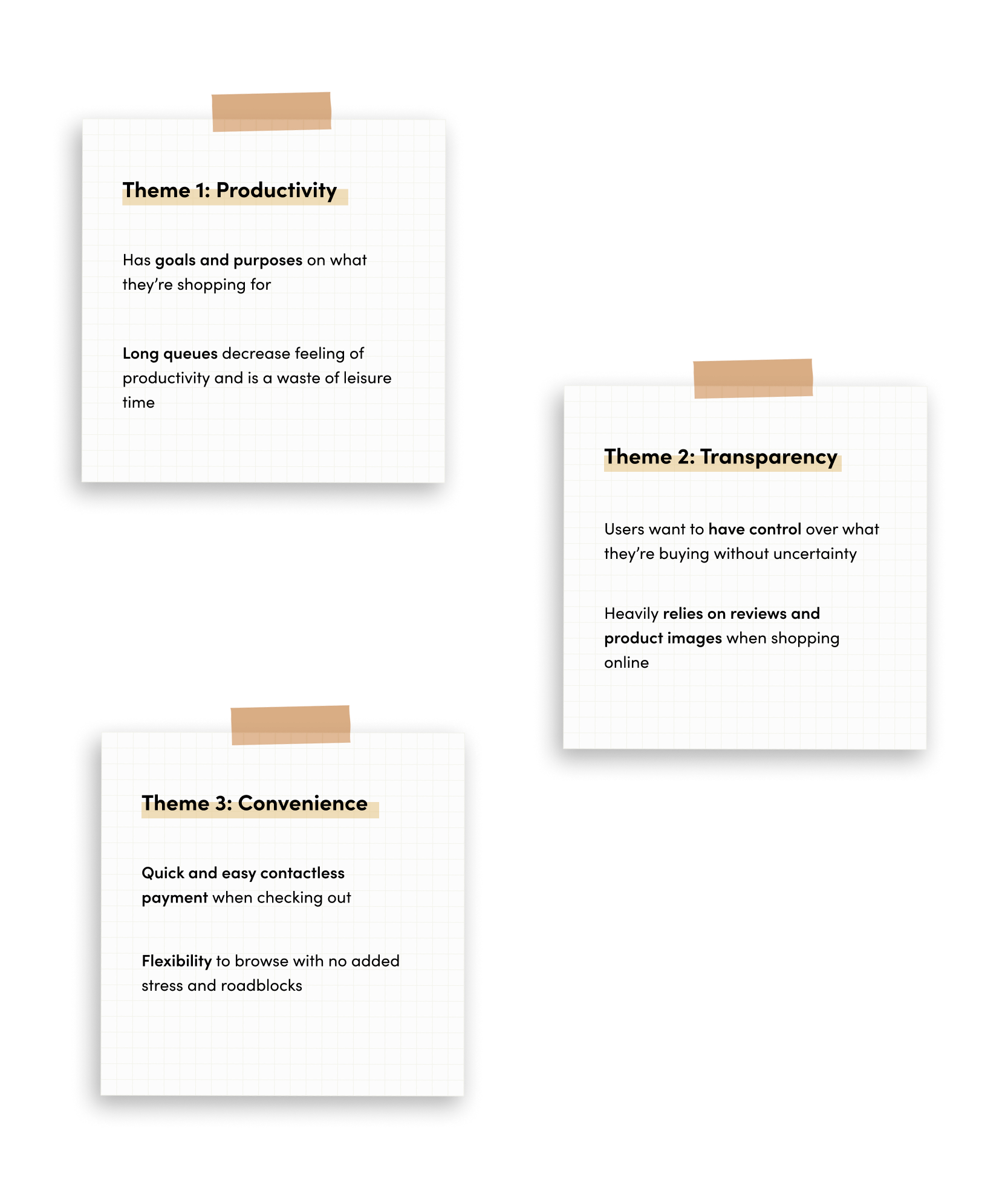
What I realized is that these groups were connected to creating a great overall shopping experience for users online and offline. I’ve also uncovered within these individual groups that there are two differing user groups - those who like to shop online and those that like to shop in stores.
MAIN INSIGHT
There has been a huge emphasis on productivity, and that many users find it counterproductive to be waiting in line.
Users shop with intent, looking for certain products for an event or work. So when these tasks and goals are not accomplished, it makes users feel counterproductive and inefficient.
USER PERSONAS
IDEATION
USER FLOWS + MVP
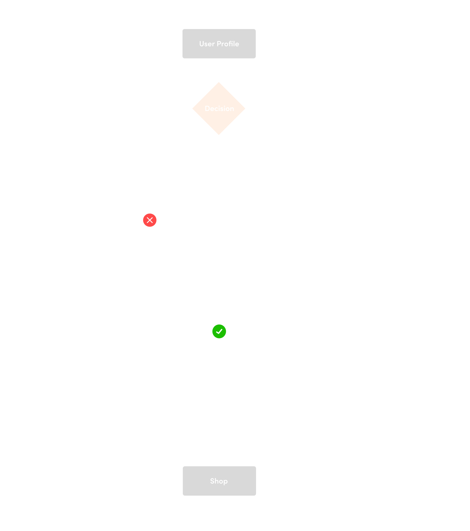
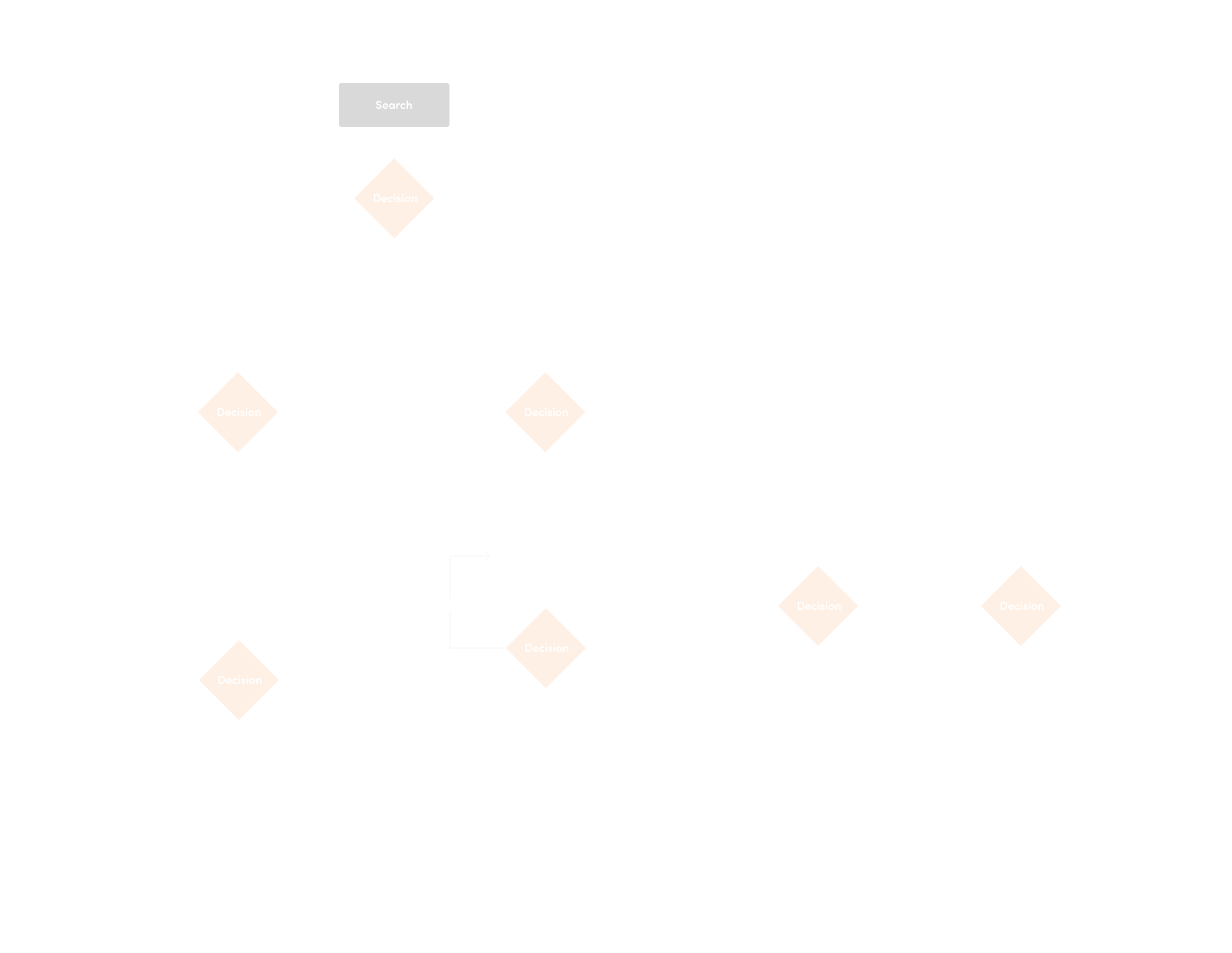
I used my MVP's to better prioritize what features will help create a better experience for our users' shopping journey online and offline. These decisions are based on how effectively the solution would help me meet the goal - which is to expedite the shopping process productively. I also wanted to take an even deeper look into the overall user’s journey while interacting with the new features. In order to more deeply empathize with the user, I created a user flow to explore the scenarios the users would be in and the different paths and decisions they would encounter when trying to complete the key tasks defined. I divided it up to three flows - login/create account, search and scan, and checking out.
WIREFRAMES
LOW AND MID FIDELITIES
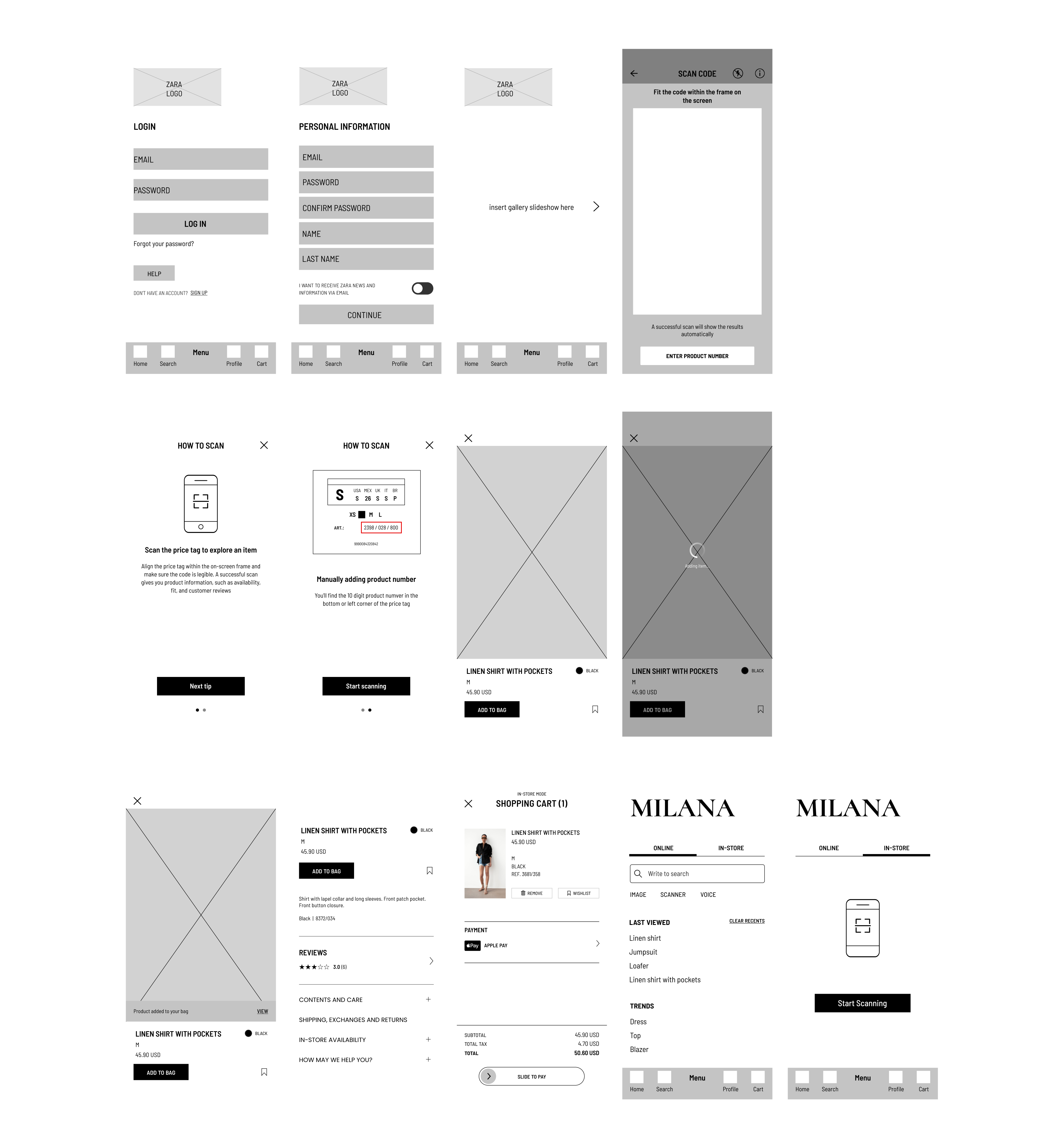
The low fidelity sketches allowed me to form decisions on how to design these new screens to help our users complete these tasks and meet their goals. Because it is a rough sketch, it helped me ideate more on what I want to add in my mid-fidelity frames which I completed on Figma. I referred back to my userflow, Sitemap, and MVP’s to get a better idea on the different frames. After making the sketches, I converted them onto Marvel so I can conduct guerilla testing for my mid-fidelity wireframes.
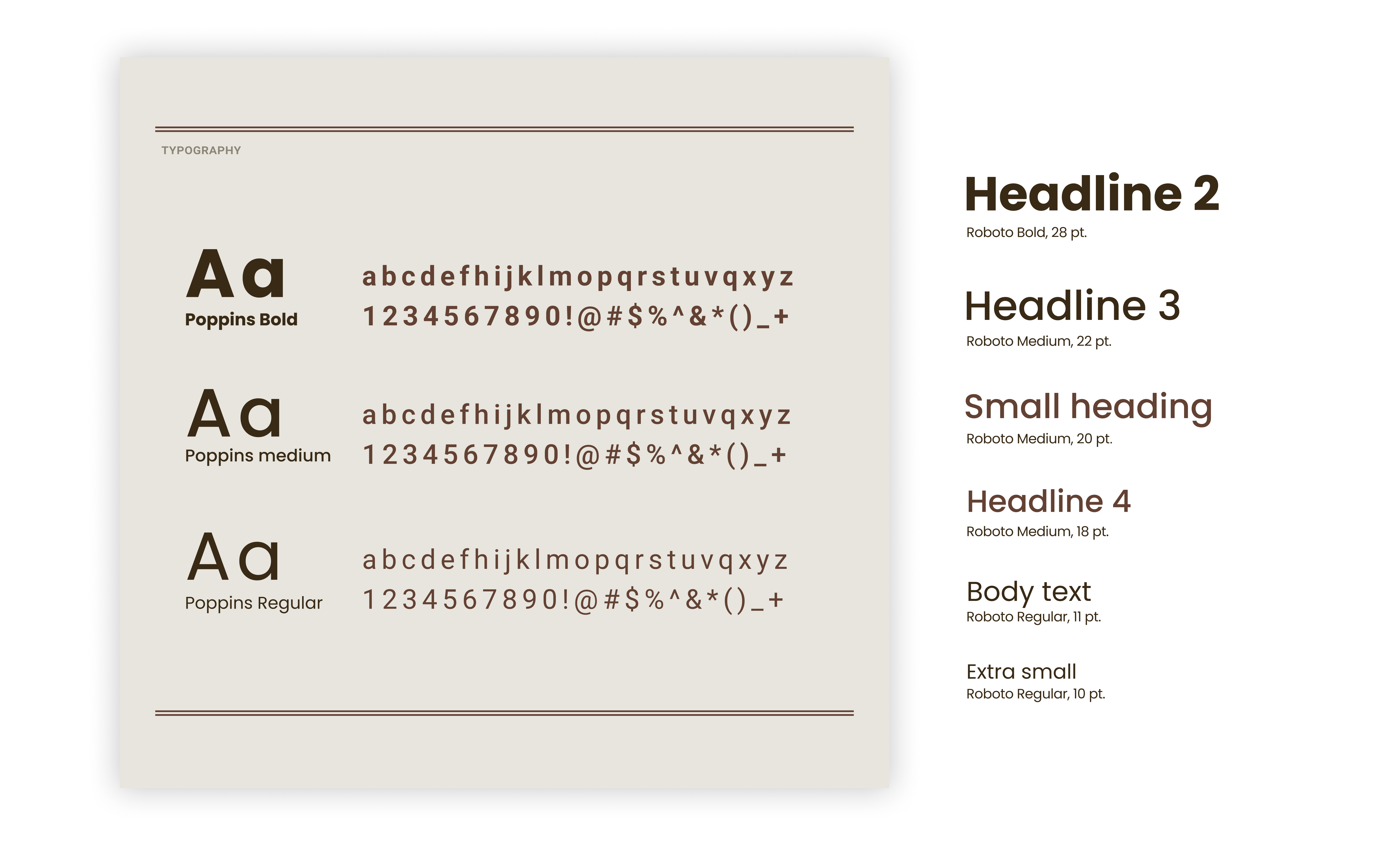
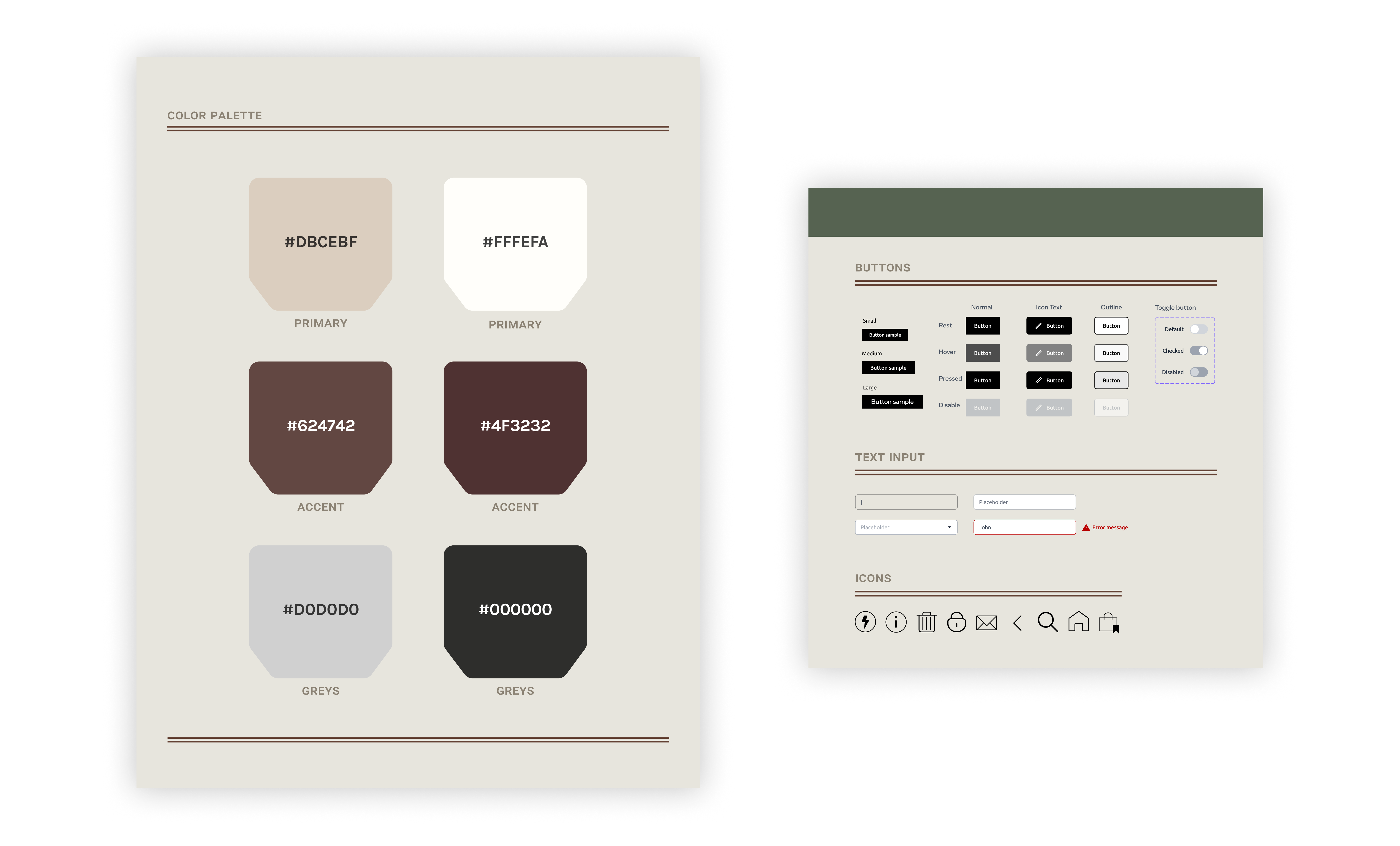
STYLE KIT
IMPROVEMENTS + SOLUTIONS
- The first issue was that user had a hard time identifying the scanning feature on the home screen. I recommend changing the “in-store” mode to pop up once users land on the homepage when they are in store, as the feature is only available when in store. User have the ability to hide it once they make a decision on whether or not they want to continue using the feature.
- Users thought the “scanner” label in the search page under “online” tab was very misleading. They think it’s the scanner for the in-store feature. I recommend the removal of this or find alternatives.
- Lastly, users had an issue identifying the “view” button after user had put the item into the bag. I recommended a bigger call to action button for “view”, show a change in cart number of items in the navigation bar, or provide a longer wording such as “View Cart”.
EXTRAS
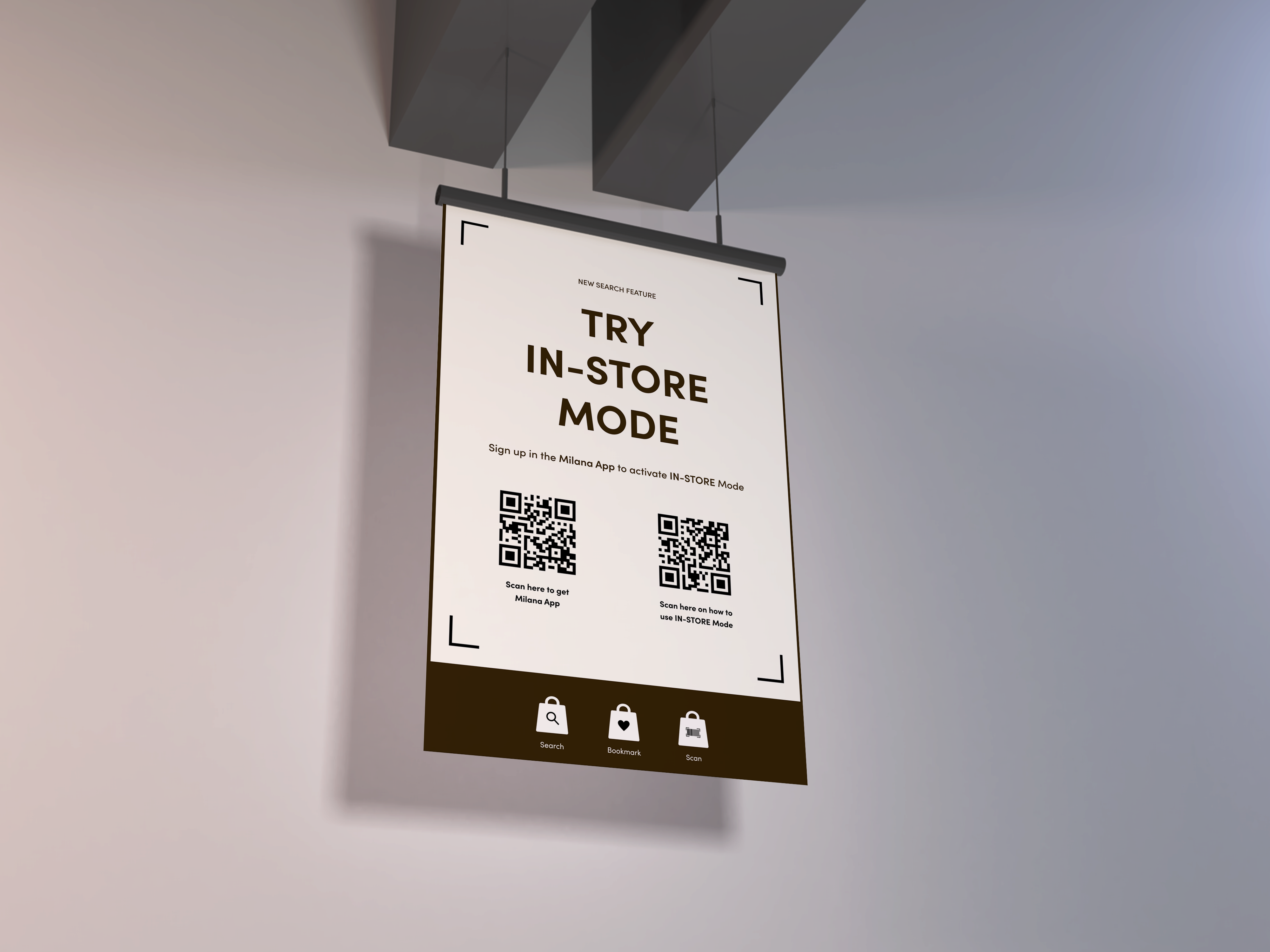
A huge focus was getting the users to identify this new scanning feature and I believe a great way is to provide banners in stores to provide more exposure. It provides step by step instructions through QR codes and can be placed around the store for shoppers to check out.
HIGH-FIDELITY
THE FINAL SHIP
My main focus after gathering insights from my guerilla testing is to make sure that users are able to easily identify this in-store scanning feature. There are two ways of accessing the scanner - through the home screen and through the search tool bar. I made sure to have good user flow in attempts to make this happen, especially when integrating an in-store experience onto a mobile app. Come check it out! →
